Zephyr
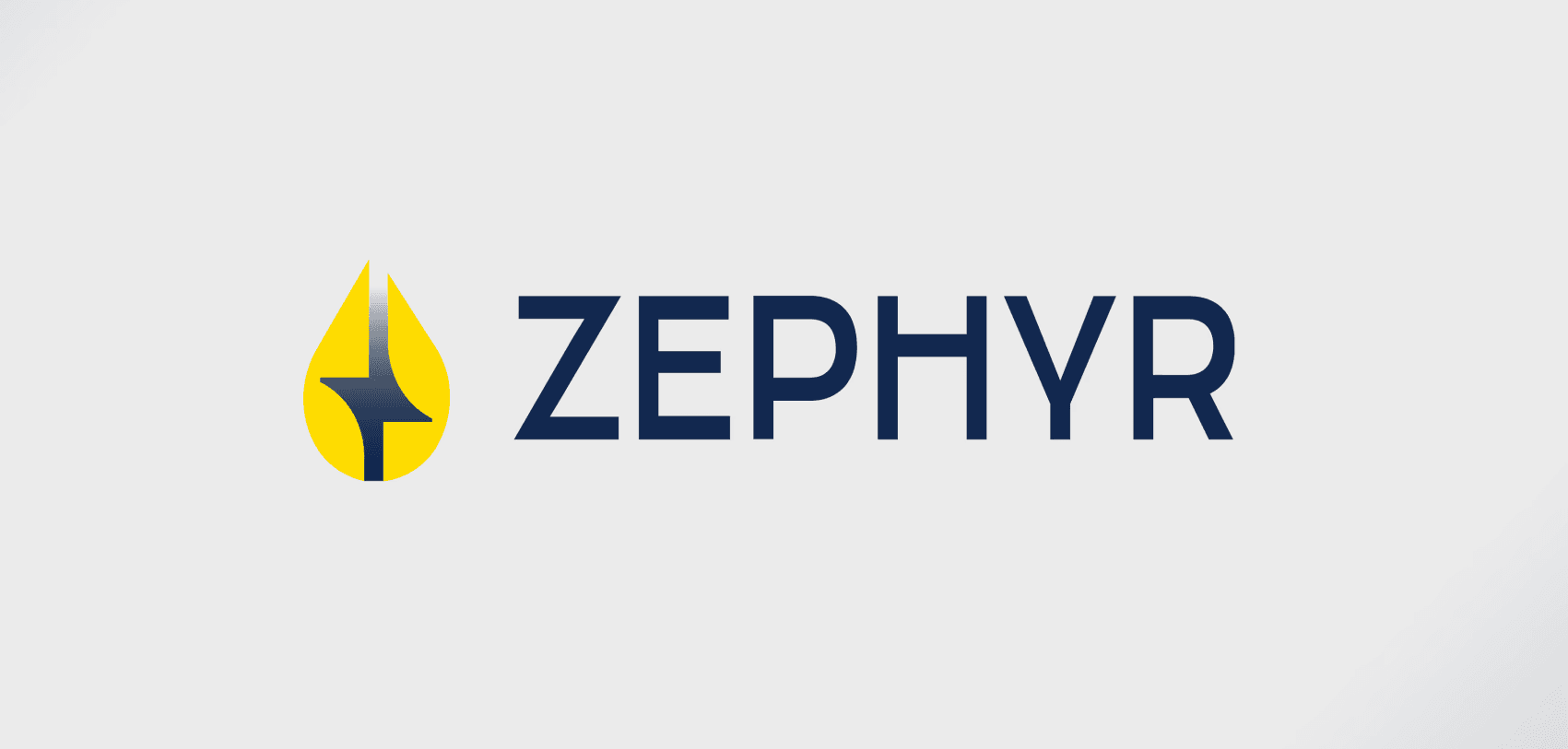
Logo and brand identity design for a fuel brand, bringing together a distinctive symbol, confident lettering, and coordinated applications across fuel equipment and transport vehicles.


Industry:
Fuel & Energy
Services:
Logo Design, Brand Identity & Canopy Design
Timeline
1 Week
The Challenge
The design challenge was to carry one clear identity across surfaces of very different sizes. A fuel-nozzle cover offers limited space, while a tanker provides a much larger area for branding. Each application needed its own layout without losing the connection to the main logo. The balance was between creating a distinctive visual presence and keeping the designs simple and uncluttered.
The Solution
We paired a yellow, droplet-shaped symbol with a clean, uppercase navy wordmark. The angular detail inside the symbol gives the logo its character, while the straightforward lettering keeps the name prominent. For the application mockups, navy backgrounds connect the fuel-nozzle cover and tanker, with yellow symbols and white lettering providing contrast. The nozzle features an enlarged graphic treatment, while the tanker uses a more restrained logo placement. These variations adapt the identity to each surface without changing its core elements.


The Result
A coordinated brand presentation that shows how ZEPHYR’s identity extends beyond the logo. The nozzle and tanker mockups share the same colours, symbol, and lettering, while using different proportions to suit their settings. Together, they establish a consistent visual direction across fuel equipment and transport branding.

