Foldward Box
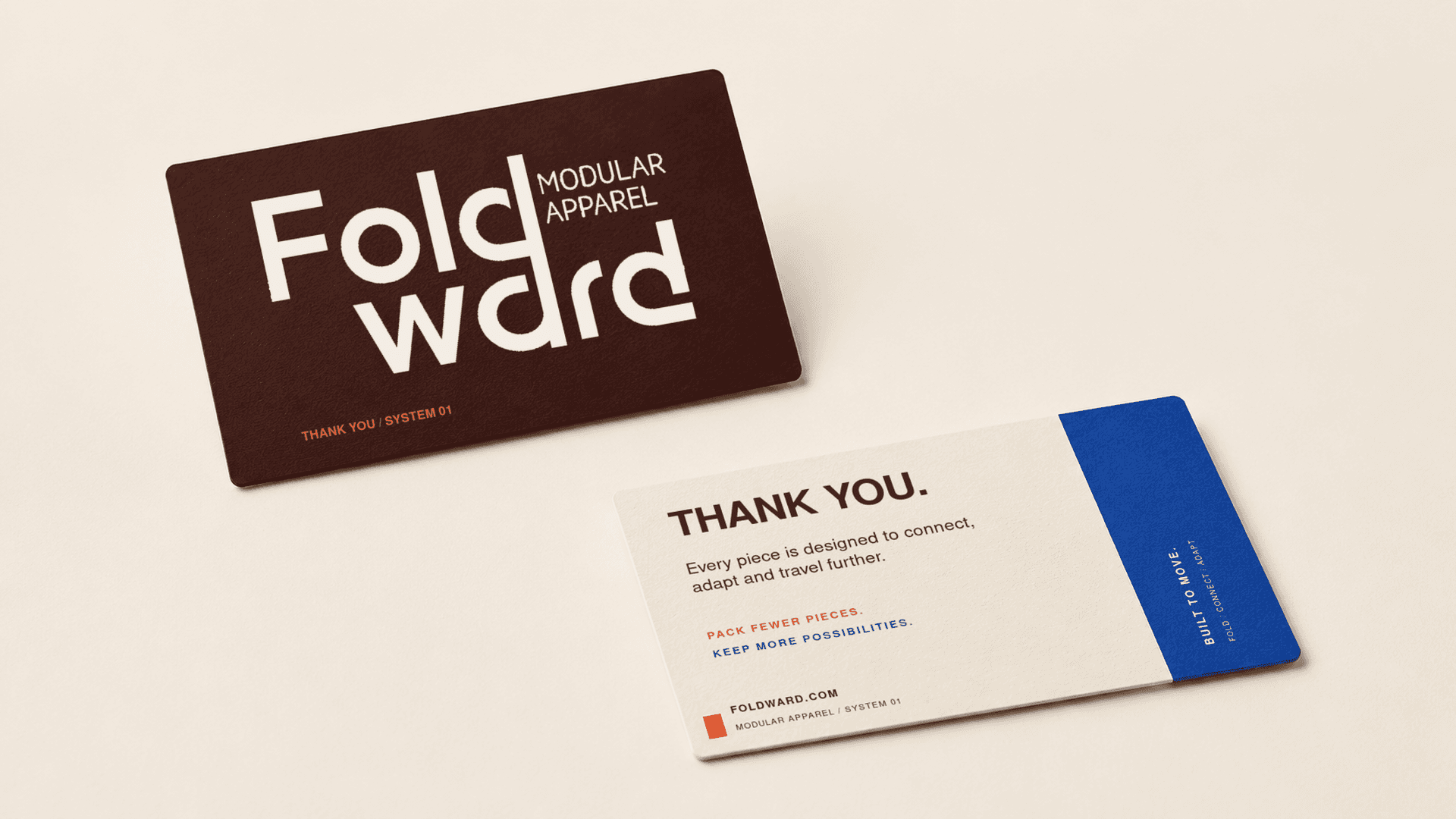
Packaging design for a modular apparel brand, combining bold typography, warm neutral tones, and contrasting colour accents.


Industry:
ECommerce
Services:
Packaging Design & Mockup Presentation
Timeline
1 Week
The Challenge
The design challenge is to express a modular apparel concept through packaging that feels distinctive without becoming complicated. The brand name needs to lead the presentation, while supporting information remains easy to find. The balance is between bold visual character and a restrained layout, giving the different packaging elements a connected appearance without covering every surface with graphics.
The Solution
We built the presentation around an off-white sleeve and a deep-brown drawer-style box. The oversized, stacked wordmark anchors the left side, with the smaller “Modular Apparel” descriptor positioned beside it. A vertical blue band creates a contrasting section for the system label and subtle line detailing. The orange pull tab adds a small, unexpected accent while marking where the drawer opens. Generous space around the main elements keeps the composition focused, allowing typography, colour, and the layered box format to carry the design.


The Result
A distinctive packaging presentation that gives FOLDWARD a clear visual character. The bold wordmark introduces the brand first, while the blue band and smaller labels organise the supporting information. The partially opened drawer shows how the outer presentation connects with the inner box, making the opening experience part of the overall design.

