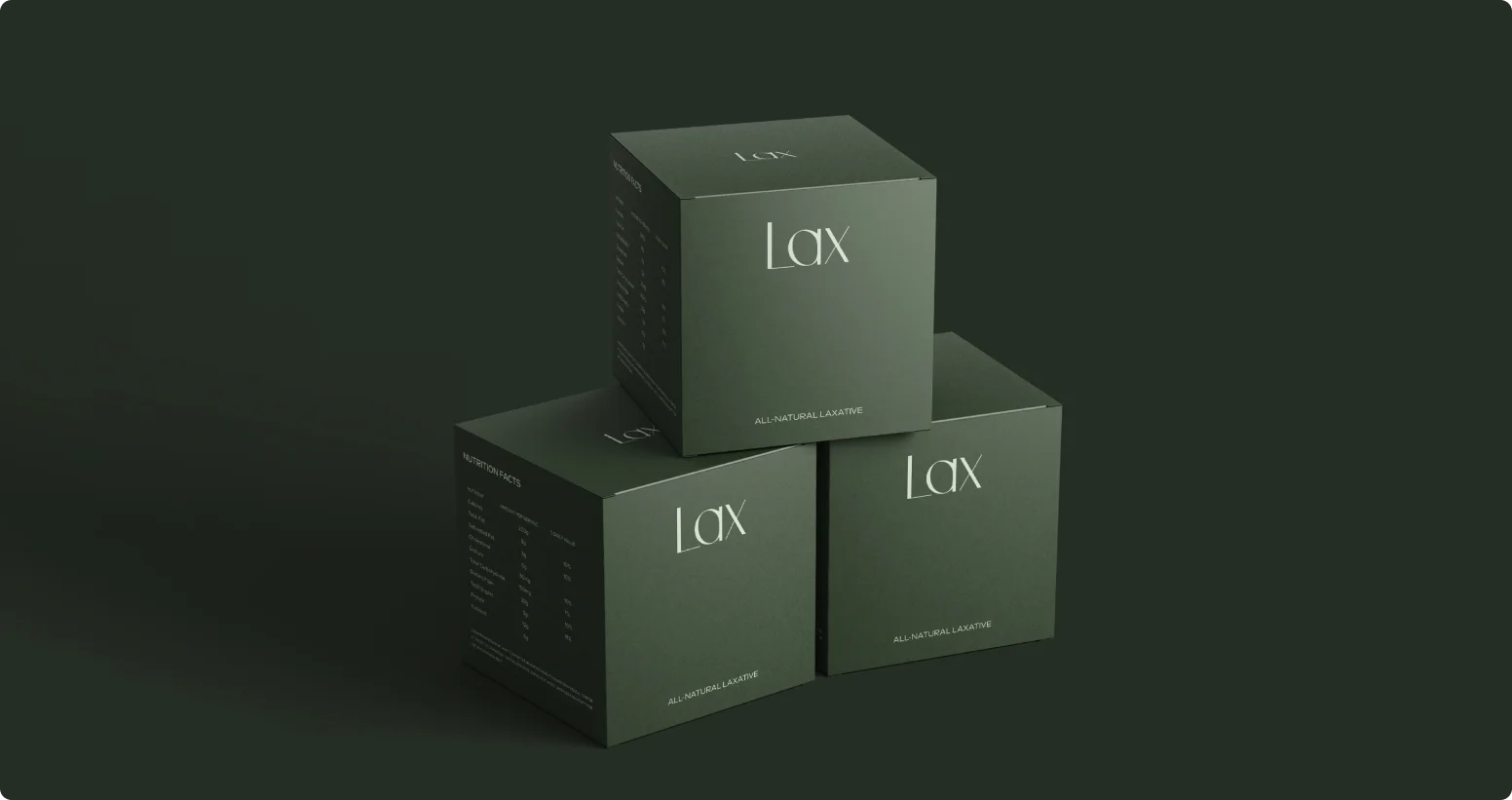
The Lax packaging design was created with a strong focus on simplicity, clarity, and premium minimalism. The goal of the design was to communicate trust and effectiveness while maintaining a clean aesthetic that reflects the product’s natural formulation. By using a refined visual approach, the packaging positions the product as a modern and reliable wellness solution.
The design features a deep muted green color palette, which symbolizes health, balance, and natural ingredients. This color choice reinforces the idea of a gentle, plant-based remedy while also giving the packaging a calm and sophisticated presence on the shelf. The dark background paired with subtle lighting effects enhances the premium feel of the product.
At the center of the packaging is the minimal “Lax” typography, set in an elegant serif style. The simplicity of the brand name allows it to stand out clearly while conveying a sense of confidence and authority. Supporting text such as “All-Natural Laxative” provides immediate clarity about the product’s purpose while maintaining the clean visual hierarchy.
The side panels are carefully structured to present nutritional information, ingredients, directions for use, and storage instructions in an organized and readable format. This structured layout ensures that important product details remain accessible without overwhelming the overall design.